Before I start, I am new here, so don’t know your background, and don’t know what your aim is for producing this book. I produced a Blurb book for myself about 15 years ago just to see how it would come out, and I learned a lot doing it.
My background is teaching basic ICT, Photography and Photoshop courses in local adult education in Liverpool over nearly 15 years or so. I am not an expert in anything, so take what I say with a pinch of salt. If you weren’t looking for feedback, then stop reading now. 
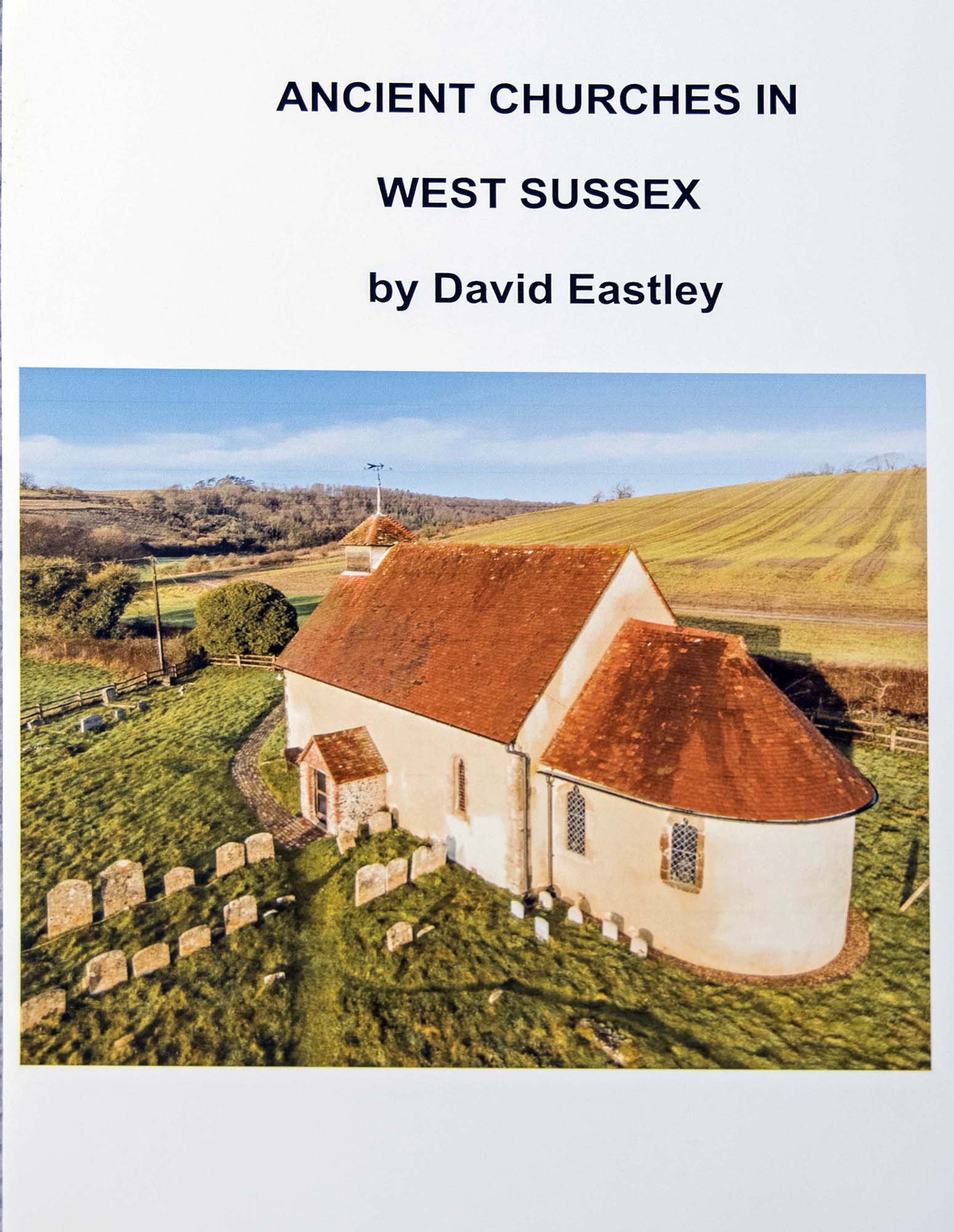
From an ICT perspective, the image and title on the front page are not centred. The image on the front is maybe a touch too big.
The writing on the inner page should describe what the aim/description is for the book. The references to appendix’s should be on another page, or in a smaller paragraph at the bottom. The text should be smaller and indented more from the edge of the page to make it stand out on the page. Check out other books to see what the convention is when it comes to layouts.
If intending the churches to be seen in a specific order, or from a specific direction of travel, I would give each church/image a number, and get a picture of a map of the area with the numbers on it to show where each building is. That would allow people to see where specific building are, if that is the one they want to visit. Yes, you give a post code and map reference, but seeing an overview of all the churches put them in context in the area covered.
There are spelling and formatting mistakes in some of the text. The layout could be more varied.
If that is the layout you want with each image, then maybe move the descriptive text to the other side for every other image. I would have the name of the church more prominent, either above or below each image, larger than the rest of the text. I was initially confused by having the location ahead of the name of the church, maybe the church name above/under each image, and the location on the right/left large and clear of the other information. The lesser information, the post code and map reference should be a lot smaller. The dating reference for each image should be consistent for each image.
Using a white background without good formatting and layout, looks a bit plain. Imho. I would put a fine stroke around each image to make the image pop of the page a little if staying with a white background.
When I did my book on Blurb, I chose to use black backgrounds, because paper quality aside, I could have printed an A4 book on white paper in work. Getting a book printed should be beyond what I could produce myself, to seem ‘special’. Again, imho.
Whilst I admire the use of drone images, if you have images of churches you were not able to fly over, I would use them for ‘completeness’ of recording all the churches, and it would also add a little variety. I understand that if the main aim is drone images, over the recording the churches, or being a guide, then you may think that is not appropriate.
If I were following your guide, and missed out on an interesting church close to another church because I did not read the appendix it would not make me a happy chap.
If you would like any advice on making changes, I will help you’d like. If you feel like this was not the feedback you were after, I apologise.